


SEJournal Online is the digital news magazine of the Society of Environmental Journalists. Learn more about SEJournal Online, including submission, subscription and advertising information.
March 1, 2015
EJ Academy
By SARA SHIPLEY HILES
Digital journalism tools offer an array of options for educators looking for new ways to liven up the classroom and tell stories better.
But not everyone has the resources or technical know-how to produce glamorous Snowfall-style pieces a la New York Times. Happily, there are plenty of solutions for making stories more interactive and compelling – at a price point even starving students and thrifty professors can handle.
We’re highlighting three free digital tools recently used by SEJ academic members for student journalism projects. All of them are ready to plug-and-play in your next awesome project. And as a bonus, check out our resource list below for even more digital ideas.
Photo slider provides before-and-after effect
David Poulson, senior associate director for the Knight Center for Environmental Journalism at Michigan State University, recently implemented two new tools that work beautifully for environmental storytelling.
The first is a photo slider tool called TwentyTwenty that allows one image to be superimposed over another. The reader slides a bar that allows a dramatic comparison between one photo and the other.
Poulson’s students last semester used the slider in stories about land-use changes: sprawl, forest fire and the impact of a cement factory. Students first had to find historical aerial images and then find the exact same land area now on Google Earth. The two photos then had to be resized and overlaid in the slider. The resulting effect allows for exact before-and-after comparison.
Poulson describes the slider as “an alternative story form that augments a traditional one.”
 |
|
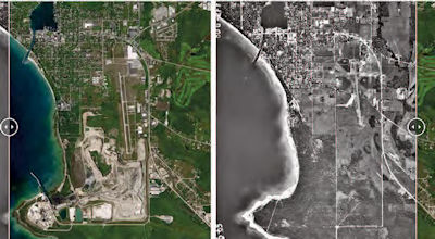
By clicking the slider control in the center of the image and dragging it left or right, major landscape changes near Charlevoix, MI, between 1965 (MSU Aerial Archive) and 2014 (Google Earth) are clearly revealed. Photo: courtesy GreatLakesEcho.org |
While looking for landfills across the state, student Nyla Hughes noticed a significant land-use change in the Upper Peninsula. “With the help of the staff in the geography building on campus, I came across a photo of Charlevoix, Mich., during the 1960s and noticed a huge difference between the past and present,” she says.
The land around St. Mary’s Cement Co. used to be filled with trees. Now, it’s full of landfills for cement kiln dust. The slider perfectly illustrates the difference.
Another story examined how a fire changed the landscape.
Student Kevin Duffy looked at forest regrowth after a fire burned through more than 21,000 acres in the Upper Peninsula. He found a 1983 black-and-white image of the area in Michigan State’s aerial archive and compared it to a 2013 satellite image from Google Earth.
The earlier photo shows dense forest, while the newer one shows open areas caused by the fire. “The change was immediately visible once the photos were overlaid and the slider implemented,” Duffy says.
Setting up the slider was easy, Poulson’s students say. There’s a dedicated plug-in on WordPress for those who use the popular publishing software, and the code is also available for other websites.
Getting the images and preparing them for use was the hard part. The archive image needs to match the new image exactly. A sharp eye and some photo-editing software are needed to line up, crop and size the photos to perfection.
Student Juliana Moxley, who used the slider to show suburban development over time, found the tool to be effective and not too difficult to learn.
“I think the slider tool is a great storytelling device,” Moxley says. “Your words can only explain so much. With the slider tool, journalists are able to give viewers an exact image of what they are trying to explain and it can make a larger impact on readers compared to only using text.”
Interactive timeline serves as visual handoff for future students
Another new tool Poulson tried last year was an interactive timeline called TimelineJS. The Knight Lab at Northwestern University developed the free, opensource tool that’s been used by publications including TIME magazine and The Denver Post.
Poulson’s students used TimelineJS to compile a history of the Velsicol Chemical Corporation/Pine River Superfund Site in St. Louis, MI. The students collected text, photos, historical documents and links to news stories and embedded them in an interactive format. Readers can scan an overview of the site’s history or click through events one by one.
Although the timeline could be useful to readers, Poulsonwanted it more as an in-house training tool for new reporters. The Superfund site is about an hour from campus, and environmental journalism students who want to write about it often lack ready access to background information.
“This is one of those complex, messy, never-ending cleanup stories that benefit from journalists who have covered them for years. We don't have those in the context of university journalism; every class starts from zero,” Poulson says. “Of course, the timeline cannot replace a longtime reporter of the story, but I'm hoping that it helps get them up to speed quickly.”
TimelineJS is simple to use; one only needs to know how to operate a Google spreadsheet to make it work.
Poulson did have some problems with scanned documents not showing up in the timeline. Another challenge was organizational, because he assigned students to work on the project in a group, and some teams did better than others.
“Still, I thought it a good exercise and maybe we'll get better at it,” he said.
Interactive map tool intuitive, engaging
I myself tried another worthwhile free digital tool from the Knight Lab. It’s called StoryMapJS, and like its timeline cousin, it’s super simple to use.
|
For more tips, check out these links:
|
With StoryMap, users can create interactive maps studded with multimedia and social media content. Its user-friendly interface makes it a cinch to add photos, text, tweets, Instagram photos,YouTube videos, SoundCloud audio clips and more.
I had used TimelineJS before and found it intuitive for student journalists and engaging for readers. StoryMap turned out to be the same.
We made our map the centerpiece of a semester-long project that paid homage to William Least Heat-Moon’s classic travel book, "Blue Highways." Least Heat-Moon’s lyrical prose took readers on a journey around the United States on the back roads, or “blue highways” as they used to appear on old maps.
My students traveled the rural byways of central Missouri to study the people and the land, and we published narrative stories about their findings.
While the students were out reporting, I had them take photos, shoot videos, record sound and publish social media posts. We pulled from that rich content when we published our map highlighting their journeys.
StoryMap provides some baked-in options for fonts and map design, and those with more advanced JSON skills can tweak it even more. My students didn’t encounter any major hurdles with the program. The hardest part was editing and organizing the content. StoryMap works best with a directional journey, a route with a beginning, middle and end; otherwise the map can appear to jump all over the place.
Sara Shipley Hiles is an assistant professor at the University of Missouri School of Journalism in Columbia, MO. She teaches science writing and digital magazine editing, among other subjects.
* From the quarterly newsletter SEJournal, Winter 2015. Each new issue of SEJournal is available to members and subscribers only; find subscription information here or learn how to join SEJ. Past issues are archived for the public here.
SEJ Publication Types:
Topics on the Beat:
Visibility: