


SEJournal Online is the digital news magazine of the Society of Environmental Journalists. Learn more about SEJournal Online, including submission, subscription and advertising information.
May 4, 2022

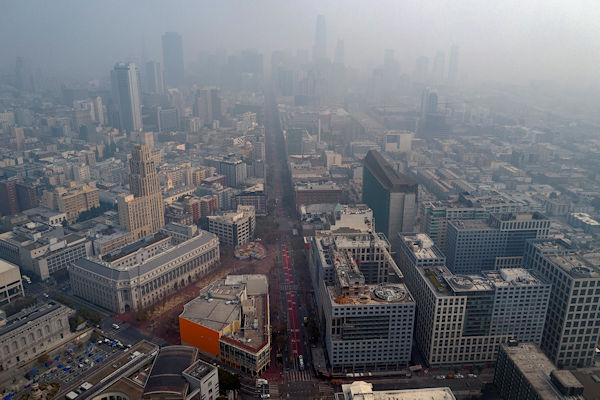 |
| Summer is typically a time for increased smog and, more recently, the smoke from spreading wildfires. Above, smoky skies over San Francisco in September 2020. Photo: Christopher Michel, Flickr Creative Commons (CC BY-NC-ND 2.0). |
Reporter’s Toolbox: As Summer Worsens Air Pollution, Data Sources Help Coverage
By Joseph A. Davis
It’s almost summer. And while for some people that means looking at baseball box scores, for environmental journalists it could just as easily mean looking at air pollution data.
One reason? Summer is prime time for photochemical smog.
The recipe for smog is complex — one baseline ingredient being nitrogen oxides, which come from vehicle exhaust. But it includes sulfur dioxide, which comes from coal-burning power plants, and many kinds of particulates, or smoke. Light and heat cook this mixture to produce ozone, which irritates the eyes and lungs.
These days, summer also includes massive climate change-driven wildfires that produce irritating smoke across much of the continent.
The whole stew is unpleasant and damages lungs.
Where the data comes from
There are numerous sources of air pollution data you can monitor. A good place to start your data search is the annual “State of the Air” report, with this year’s newly released by the American Lung Association. It presents air pollution data clearly and with fine resolution, is easy to use and well worth exploring.
Note that a lot of the report’s data comes from the U.S. Environmental Protection Agency, and from state and local air pollution agencies. The EPA makes serious efforts to check the quality of the data it collects and publishes — but keep in mind that air quality changes on a daily and even hourly basis.
If you want to go directly to the source,
EPA displays a lot of its air quality data
in near-real-time on its AirNow site.
If you want to go directly to the source, the EPA displays a lot of its air quality data in near-real-time on its AirNow site. The site has gotten better over the years and is best for immediate takes.
Another very handy data resource in this ballpark is the EPA’s annual series of air quality status and trends reports, which zoom out for the long view. All of these reports discuss in more detail where their data comes from.
How to use the data smartly
One good reason you might start with the State of the Air report is how evaluative it is. That is, it gives localities letter grades. And it is a tough grader.
If you’re thinking that’s also one bad reason to start with the report, keep in mind that since the Lung Association is all about human lung health, there is no doubt about where it is coming from. And without delving into the endless and fruitless philosophical debate about journalistic objectivity, Toolbox will just say it is OK to be against air pollution.
Another good thing about the State of the Air report is that it explores a wide range of air pollutants. It does better than AirNow at making the links between pollution and demographics, which matters if you are considering environmental justice. It does a great job at connecting air pollution with specific health effects (and vulnerable populations).
Both the State of the Air report and AirNow allow you to get down to fine geographic resolution. You can literally look up your own ZIP code (as well as a particular city or state, etc.)
One very instructive aspect of the State of the Air report is the way it presents time series. It not only shows you the progress your area has made over the past two decades, but also compares that to levels that amount to “good” air. Behind the letter grades is this kind of rigorous and “objective” analysis.
And of course, the TV news directors may like the fact that the Lung Association fearlessly picks out “best” and “worst” states. And for the activists in your community (and those thinking about “solutions journalism”), note that the report also talks specifically about things that can be done to improve air quality.
[Editor’s Note: Toolbox has also written previously about the network of air quality monitors whose data goes into EPA air pollution scores. Smoke pollution is very dynamic; Toolbox has more on that as well, and here’s more on smoke’s health risks. Also see previous TipSheets on an earlier “State of the Air” report, and summertime air pollution, as well as on air pollution in U.S. national parks. SEJournal has also published a feature on air pollution from author Beth Gardiner, and a review of her book, “Choked.” And don’t forget that you can track the latest “air pollution” stories on our EJToday headline service.]
Joseph A. Davis is a freelance writer/editor in Washington, D.C. who has been writing about the environment since 1976. He writes SEJournal Online's TipSheet, Reporter's Toolbox and Issue Backgrounder, and curates SEJ's weekday news headlines service EJToday and @EJTodayNews. Davis also directs SEJ's Freedom of Information Project and writes the WatchDog opinion column.
* From the weekly news magazine SEJournal Online, Vol. 7, No. 18. Content from each new issue of SEJournal Online is available to the public via the SEJournal Online main page. Subscribe to the e-newsletter here. And see past issues of the SEJournal archived here.
SEJ Publication Types:
Topics on the Beat:
Region:
Visibility: