SEJournal Online is the digital news magazine of the Society of Environmental Journalists. Learn more about SEJournal Online, including submission, subscription and advertising information.
 |
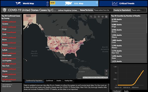
| Johns Hopkins’ COVID-19 dashboard, shown above, is widely considered the gold standard for pandemic data. Image: Johns Hopkins Coronavirus Resource Center. Click to enlarge. |
Reporter’s Toolbox: COVID-19 Data Challenges Can Spark Better Journalism
By Joseph A. Davis
The COVID-19 pandemic is pushing journalists in new directions — and one may be the intersection of the environment and epidemiology.
And data tools are a key part of telling the story, however awful. On cable news, there is always the box counting cases and deaths. There. Always.
But telling people about the pandemic may mean telling environmental stories. A previous Reporter’s Toolbox highlighted COVID-19 reporting resources. Here are several additional worthwhile sources meriting a showcase:
Johns Hopkins Coronavirus Resource Center
Remember bioterrorism? Remember anthrax? Even back in 2001, there was a need for experts in things that could kill a lot of people unexpectedly.
Johns Hopkins University is world-renowned as a center of medical excellence. It has a Bloomberg School of Public Health, which has a Center for Health Security. And in the center of all that, it has the Johns Hopkins Coronavirus Resource Center, which even clueless White House bureaucrats turn to when they need solid information. Also the news media.
The center has a kind of COVID-19 dashboard, which tells you at a glance in near-real-time what the numbers are in every county, in every state, in the United States and in every country.
It’s the best information available (and we note that information is often imperfect), presented in map and tabular form, with rates and trends.
Smart people turn the data, the quest for it, the lack of it and the consequences of it, into many press-release style stories. But it’s not puffery, it’s expertise.
The center produces daily situation reports which are much truer, more precise, more crisp and more informative than the evening White House briefing.
Associated Press data.world
A related tool worth discovering and exploring is part of a huge project at the Associated Press. One of its main names is data.world. It’s hardly just about COVID-19, but it seems to be doing that very well.
To risk simplifying it, data.world is an ambitious and perhaps revolutionary platform for applying vast stores of data to the kinds of questions journalists ask (or should be asking), in ways that make information useful to non-geeks and which encourage more collaborative projects at a time when journalism sorely needs them.
Yes, it sort of sounds like a commercial and it sort of is. But it’s also a visionary effort to make the best use of AP’s untapped, potential strengths — its hundreds of members who are still the meat and bones of the U.S. news business.
The basic strategy for finding
environmental justice stories
is layering data in maps.
Also, it taps a large team of data journalism aces who have notched some major accomplishments (Toolbox particularly admires their breakthrough work on dam safety in November 2019).
What they are good at is taking a national story (whether COVID-19 or dam safety) and turning it into a set of urgent and incisive local stories with the collaboration of AP members. That’s what data.world could be.
Meanwhile, we are down here counting COVID-19 cases. The open-source part of the AP data.world includes interesting data like state-by-state testing numbers. It has also incorporated the Johns Hopkins case data down to the county level.
The fastest way in is to choose the “free trial” option.
EPA environmental justice tracking and mapping tools
An interesting and important story to tell about COVID-19 on the environmental beat will be how it connects with pollution and demographics (and yes, demographics can include everything from racism to poverty to health care access and more).
We are not there yet, but the U.S. Environmental Protection Agency can help get us closer.
For years, EPA has had a somewhat unheralded data tool called EJSCREEN. It is still there, online, free to use.
The basic strategy for finding environmental justice stories is layering data in maps. Map where the pollution is, then map where the poor people are, then map where the African American people are, then map where the hospitals are (or aren’t).
When you overlay these maps, you find stories — like those in the small, isolated minority towns in Louisiana’s “cancer alley.”
You don’t need special software to use EJSCREEN, because it is usable online.
But if you want to pursue this kind of journalism, it helps to build your capacity to use proprietary geodata software like ArcGIS. It costs, but free demo copies are often available to journalists. Google Maps is a not-free mapping software you might also use. A lot of the data and tools from the Census Bureau are free and online also.
Editor’s Note: You may also want to visit SEJ.org’s COVID-19 Resources for Journalists page, where SEJ is compiling articles, resources, funding opportunities and events to aid in your reporting on the COVID-19 pandemic.
Joseph A. Davis is a freelance writer/editor in Washington, D.C. who has been writing about the environment since 1976. He writes SEJournal Online's TipSheet, Reporter's Toolbox and Issue Backgrounder, as well as compiling SEJ's weekday news headlines service EJToday. Davis also directs SEJ's Freedom of Information Project and writes the WatchDog column and WatchDog Alert.
* From the weekly news magazine SEJournal Online, Vol. 5, No. 18. Content from each new issue of SEJournal Online is available to the public via the SEJournal Online main page. Subscribe to the e-newsletter here. And see past issues of the SEJournal archived here.


